
Overview
Redesigned 80+ accessible screens to unify the NDIS mobile app during the PACE enterprise migration.
As part of a massive digital transformation, the National Disability Insurance Scheme (NDIS) decommissioned its legacy SAP-based CRM (P1) to transition to PACE, a modernised Salesforce platform (P2 and S33). I led the UX/UI redesign of the NDIS mobile app for its critical November and December releases. By utilising our newly built platform-agnostic design system, I ensured the app was visually and functionally aligned with this new enterprise architecture.


Problem statement
The previous iteration of the NDIS app was heavily bottlenecked by the rigid limitations of the legacy SAP platform. Because of these technical constraints, the front-end experience suffered from fragmented UI patterns and disjointed user journeys, creating unnecessary cognitive load.
Most critically, the legacy app had significant accessibility issues—a fundamental failure for a product designed specifically for users with diverse disabilities. The business-driven PACE migration provided the necessary catalyst to not only upgrade the backend architecture but to completely overhaul the front-end UX, ensuring visual consistency, modern usability, and strict accessibility compliance.
Users & audience
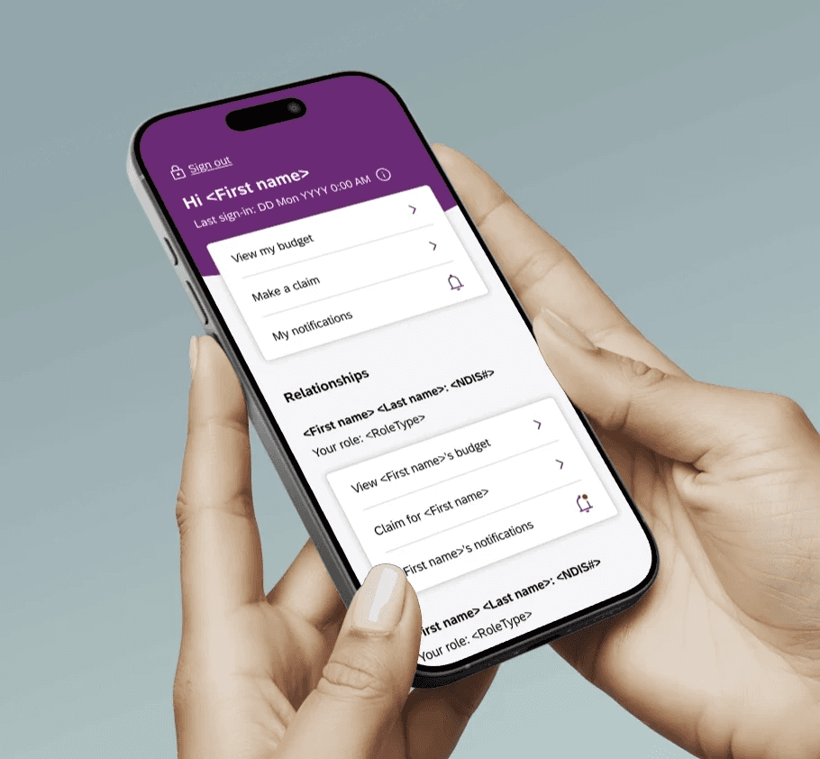
The app serves NDIS participants managing their own plans, as well as Nominees (carers, family members, or professionals) who manage plans on behalf of participants. The diverse cognitive, visual, and motor abilities of this user base meant that AAA accessibility, clear navigation, and jargon-free interactions were absolutely paramount.
Roles & responsibilities
Role: Lead UX/UI Designer
Responsibilities: Led the end-to-end UX/UI redesign of the mobile app for the November and December releases.
Mapped complex logic to accommodate users across legacy (P1) and new (P2/S33) plan structures.
Applied the new foundational design system to ensure an accessible, platform-agnostic UI across Android and iOS.
Scope & constraints
Constraints: We were bound by a strict, non-negotiable deadline for the November and December releases.
Scope: The scope was massive, requiring the mapping, logic-resolution, and high-fidelity design of over 80 individual screens across 15 distinct user journeys and dozens of edge-case scenarios.
Processes
To tackle the sheer volume of screens required for the release, I categorised the UX architecture into core functional pillars. This ensured that participants on different platforms (P1, P2, S33) received a consistent, unified experience:
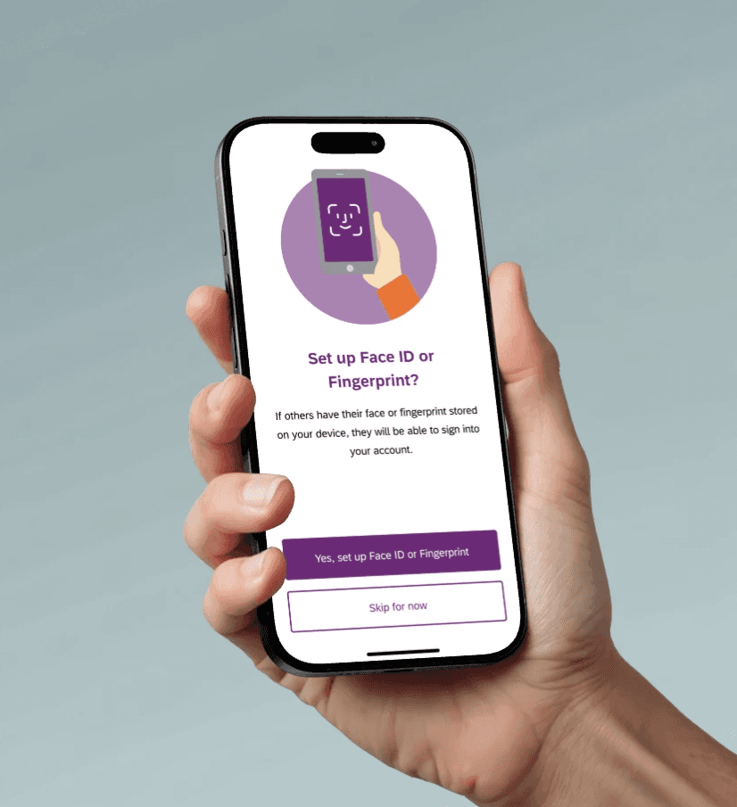
Authentication & Security: Designed seamless onboarding and auth flows, including biometrics, PIN management, Nominee access toggling, and complex security states (e.g., ceased access).
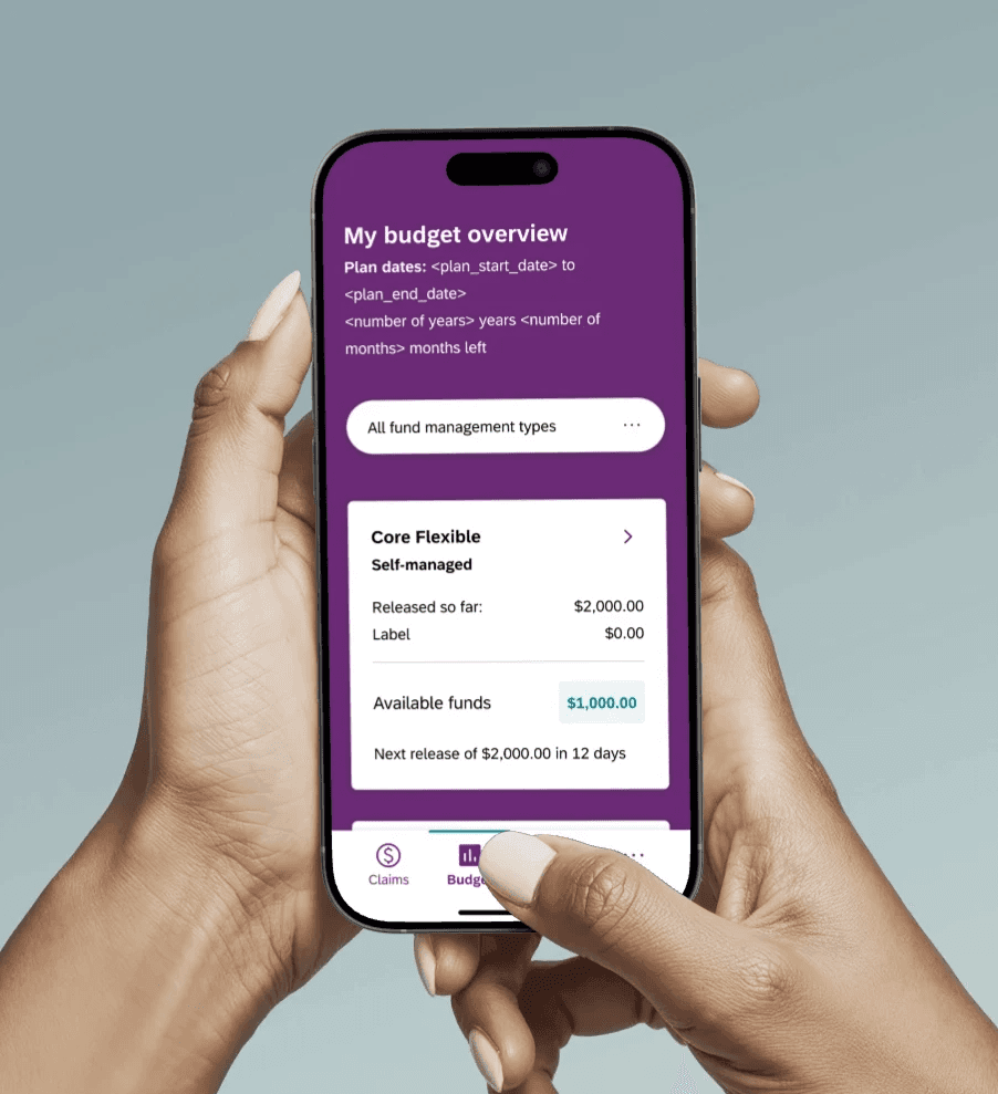
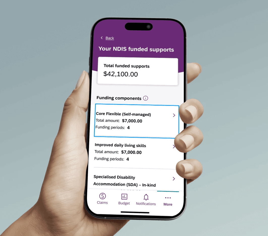
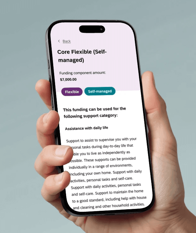
The Claims & Budget Engine: This was the most complex architectural challenge. I had to design distinct logic flows that looked visually consistent but catered to different backend plans
Account & Nominee Management: Created dedicated landing pages and switching mechanics for Nominees managing multiple participants, alongside deep account settings (privacy, communication preferences, Dark Mode).
Support & Exception Handling: Designed the Service Hub and Enquiry forms, alongside a robust matrix of exception handling screens (planned maintenance, app version restrictions, network errors) to prevent user panic during outages.
December Enhancement: Designed and integrated push notification opt-in flows to support proactive user communication.
Outcomes
Unprecedented Consistency: By deploying the new platform-agnostic design system across the entire app, we successfully aligned all UI patterns. The fragmented, disjointed experiences of the legacy app were completely eradicated.
Seamless Multi-Platform Integration: Successfully delivered a unified front-end experience that elegantly masked the complex, fragmented backend logic of P1, P2, and S33 plans.
Accessibility Excellence: The redesigned app was rigorously stress-tested for accessibility. By relying on our custom-built UI components rather than native defaults, we ensured total compliance and a highly inclusive experience for all NDIS participants.
Lessons Learned
Designing for an enterprise transition of this scale taught me how to bridge the gap between heavy backend technical constraints and front-end user empathy. It proved that a well-architected design system is the ultimate force multiplier—without the foundational tokens and components we built prior, designing and aligning 80+ screens across three different plan types within a strict two-month release window would have been impossible.